

As Seen in the Wild Series
After diving into breakthrough barriers in the store environment in part 1, we are going to zoom in on potential package pitfalls that are easy-to-miss. With thousands of packages vying for a shopper’s attention throughout a trip, the little details that you can only see in-store, make or break how your design competes with all the others.
Here are 3 Potential Package Pitfalls your brand needs to get right!
Shippers
When shippers are your intended method of shelving your products, think of them as an extension of your packaging. Just as easily as they can help your brand stand out, they can also hurt your brand’s ability to be seen and understood.
This Folger’s Gourmet Supreme shipper blocks a good chunk of the package, including the actual type of coffee. The shipper itself doesn’t add any value or leverage core color equity and turns the shipper into a net negative.


On the other hand, Sparking Ice uses shippers that strategically and intentionally integrate with their packaging. They align all of their bottle communication above the carton and the carton itself allows Sparkling Ice to have a larger billboard to stand out.

In Costco, this Blue Diamond Almonds shipper does a great job of using the extra space to create intrigue and promote this new flavor of almonds while letting the package convey more of the product details
Challenging Structures
Package structure is the first thing shoppers use for navigation, but not all structures are equally shoppable. A yogurt cup has a harder time succeeding at-shelf compared to a cereal box. The other issue with challenging structures is they are more likely to be stocked poorly and affected by shopping chaos. Brands must do what they can with design to overcome the issues that come with a challenging structure.
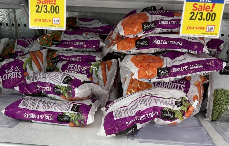
These store-brand bags of vegetables lack the structural integrity to stand up on their own and are often flipped over. All it took was a bit of shopping chaos to turn their entire brand block into a big mess, creating a lot of friction for shoppers just trying to find some frozen peas and carrots. Bird’s Eye frozen vegetables avoid this issue by changing the structure to stand-up pouches.

When you can’t change structure, lean on design to overcome challenges. A great example comes from Chobani. They have fruit images on all sides of the cup, making the flavor understood from any angle.
Pillsbury Corn Bread does something similar with color. The color band across the top distinguishes the product, even when facing away from shoppers.

Lighting
Lighting makes a huge difference for shoppers. If accounted for during the package design process, it can make a product look great. If not, your products can get lost in shadows or be too shiny to see.
For example, on its own, this Arc teeth whitener looks colorful, vibrant and like it would stand out from the competition leaning into white. But, when placed into a real shelf set, the choice of black suddenly seems like a big mistake. The shadows created by the above shelf make the product blend in allowing the lighter alternatives to really shine.


Speaking of shine, it can also be a BAD thing for noticeability. These new Bolthouse Farms designs have a glossy finish that reflects light on the most important parts of their package. Combined with the light-colored background and the white text, it is hard to read what the brand is and what the flavor/benefits are.
.